The Grid Tab
Use this panel to configure the Grid view if you selected View=Grid on the General tab.
The Grid tab contains the following fields:
- Grid view configuration (custom form)
You can use the controls in this field to design a grid for controlling the position and layout of the widget's related teaser views. You basically design the grid by selecting the Bootstrap style classes from which it is to be constructed on various devices.
The field contains the following controls:
Basic grid/Advanced grid
Select the grid style you require. If you select Basic grid:
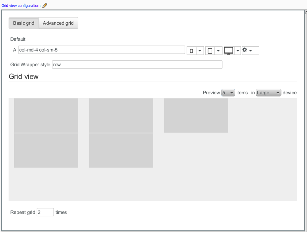
then you can only define one set of style classes, which is applied to all cells in the grid. If you select Advanced grid:
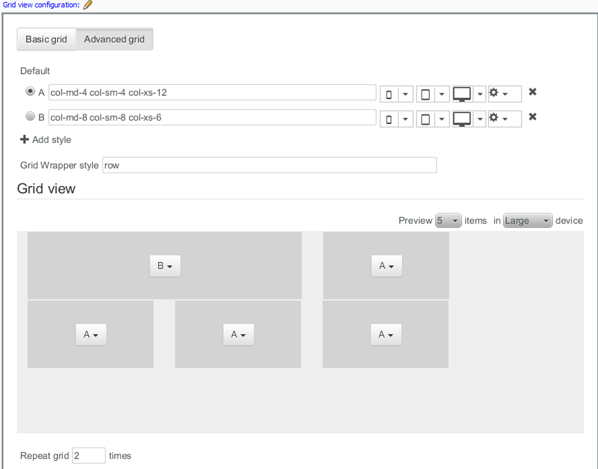
then you can define any number of style class sets and apply them individually to each cell if you wish.
A, B, C etc
Each row of controls represents a style class set. If you selected Basic grid, then there is only one row, A. If you selected Advanced grid then you may create several by clicking on + Add style. The main field in each entry contains the names of a set of style classes to use: one for desktop devices, one for smaller tablet-style devices and one for extra-small devices such as mobile phones. To fill the field, select a style from each of the drop-down menus immediately to it's right. The last drop-down menu contains additional style classes that you can add to the set in order to control cell margins and padding.
If you selected Advanced grid then you can delete a style class set by clicking on the delete button at the far right. You can also select one of the style class sets as the default style by clicking on one of the radio buttons on the left.
Grid wrapper style
The style class to use for wrapping the whole grid.
Grid view: The grid view provides an interactive view of the layout as you define it. You can choose how many cells you want to include in the preview using the Preview n items control, and you can also switch between different device type previews using the in X device control. If you selected Advanced grid then you can individually select style class sets using the drop-down controls displayed in each cell.
Repeat grid n times
The number of times you want an advanced grid pattern to be repeated. Setting the number of repetitions in this way has no meaning for a basic grid.
The pattern defined in an advanced grid is used as follows for a preview containing five cells:
-
If the widget's data source returns five content items or less, then the output will exactly match the preview.
-
If the data source returns more than five content items, then the grid is used for the first five items, but all remaining items are rendered using the default style class set.
-
If, however, the Repeat grid n times has been set to 2, then the grid shown in the preview will be used for the first 10 items, and only after that will the default style class set be used.
-
- Related view (relation)
You can drop views (Teaser View widgets, for example) in this field. Any views that you drop here can be used by this widget to render content. To configure this widget's use of a view widget dropped in this field:
-
Select the dropped view widget.
-
Edit the fields displayed in the Element properties panel. These fields let you control which of the views are used to render particular content items. For documentation of these fields, see the description of the appropriate view:
-
Owner Widget Settings for Master view
-
Owner Widget Settings for Teaser view
-
Note that, Master view is currently recommended to use with Content Body widget only.
-